Place Strategy – Continental Europe
Have you been to a place where you’ve gotten lost easily and navigating the space was challenging? What about that place made it confusing to orient yourself?
In talking about good urban design, in Image of the City, Kevin Lynch describes how people rely on the 5 elements of paths, edges, districts, nodes, and landmarks to shape mental maps of the built environment. The physical design, the placements, and the relationships between these elements affect our cognitive process to navigate through space and the city. While these elements described by Lynch serve as markers at a macro level, for the user journey to be truly seamless and engaging, we need the added layer of optimizing for the human scale.
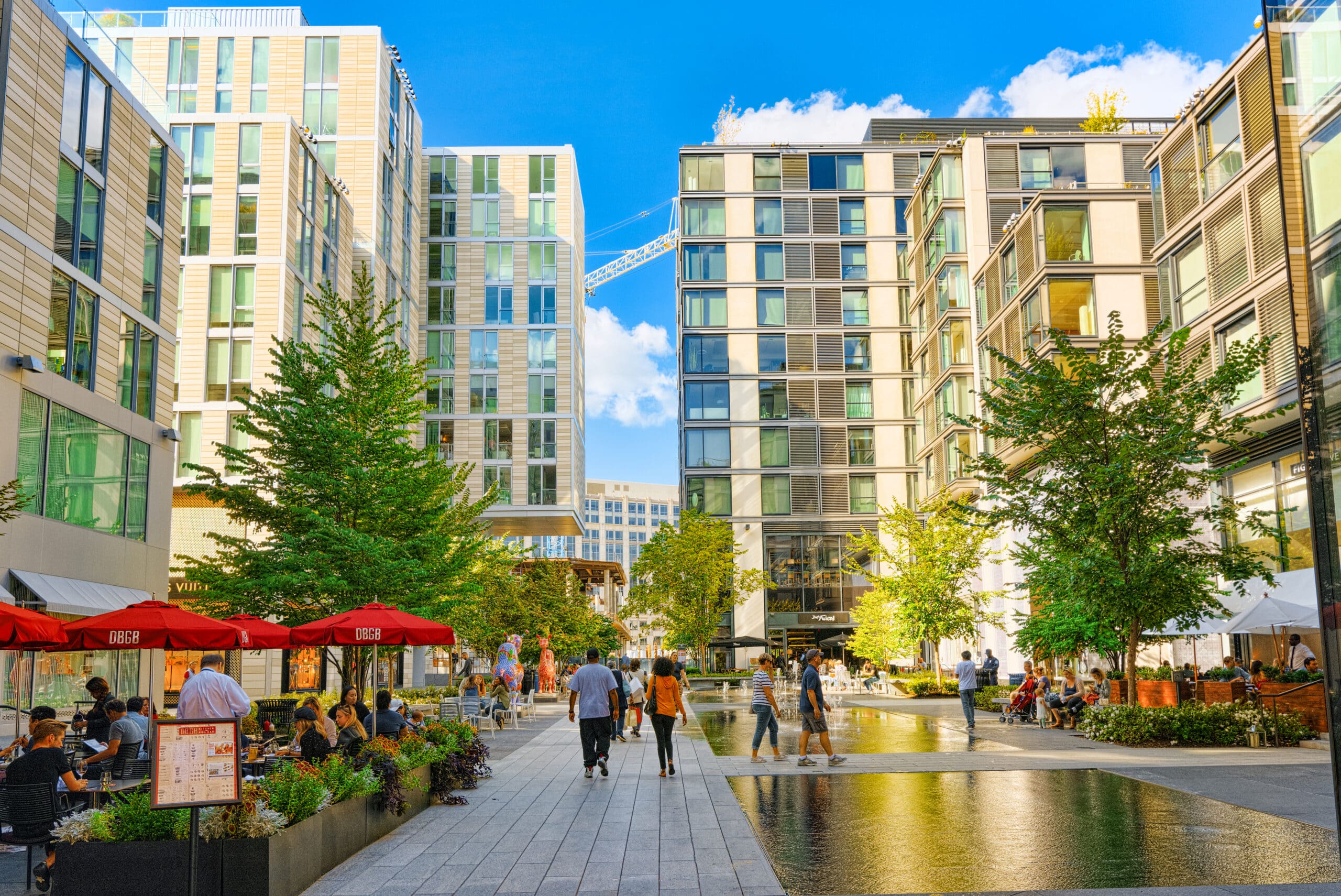
As humans, we rely on our senses of sight, sound, smell, and touch to orient ourselves in the physical space and navigate from place to place. Often, visual cues such as an engaging storefront or the sound of a bustling and vibrant street are enough to hint that there is something beyond that is worth exploring. We don’t necessarily need to be explicitly told “head in that direction” with a sign to navigate a place.
Yet many mixed-use developments and in particular, outdoor retail environments often rely heavily on traditional signage to guide us through the space. While signage certainly helps, no amount of traditional signage will fix fundamentally poorly designed spaces that provide no sensory cues as to which way to go. A building with a blank façade and no indication of the entrance will remain challenging even with a signpost pointing towards the entrance.
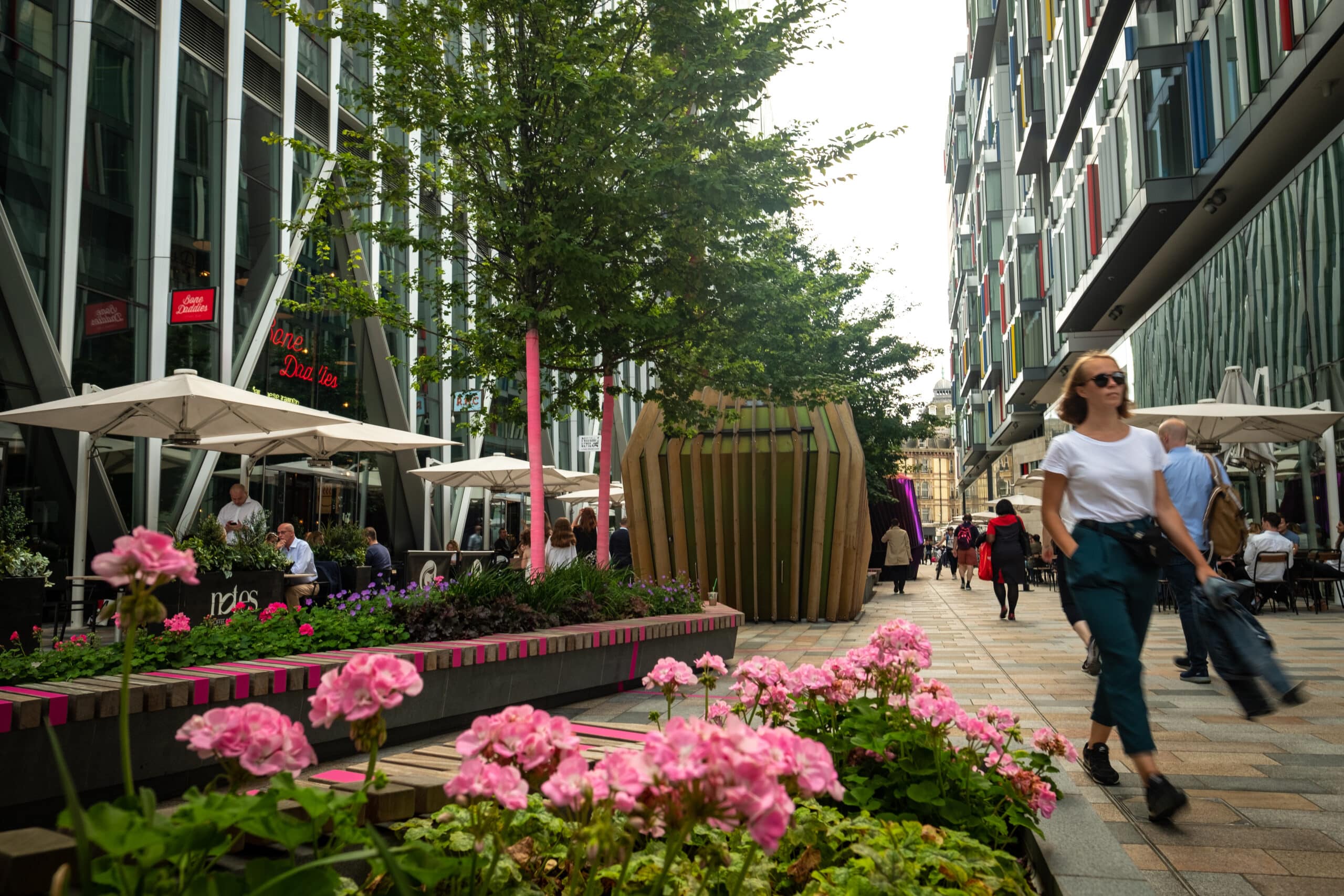
By designing stimulating environments through the integration of art, landscape, engaging storefronts, and pleasant and active sidewalks that optimize for the human senses, we can create places that don’t depend on traditional signage. Good wayfinding is more than a sign; it can be elements that elicit curiosity and sensory cues that serve dual purposes if designed and placed correctly.
A non-descriptive concrete parking structure with a mural that pops can signal the entrance from afar. An empty open space with programmed activation is a welcoming signal that calls one to be an urban participant. A retail storefront that has interesting façade articulation with activities spilling into the sidewalk is a marquee that gestures one to come in. While none of these design details are new ideas, we often see new developments stripped down to basic infrastructure for the sake of efficiency and modern design. By prioritizing the design of the built environment to human experiences at eye-level and incorporating intuitive breadcrumbs that are visual cues for the user journey, we can create great wayfinding without signage.
BACK TO LATEST

